Artist Spotlight: Ryan Daley
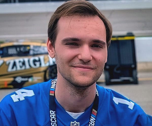
In the second installment of our Artist Spotlight series, we asked graphic designer and popular Trading Paints painter Ryan Daley eight questions about the world of motorsports design from his perspective.

Freelance graphic designer Ryan Daley took some time out of designing some of the coolest paints on the NASCAR circuit to talk about his career, his unique style and love for old-school designs, and advice for up-and-coming painters.
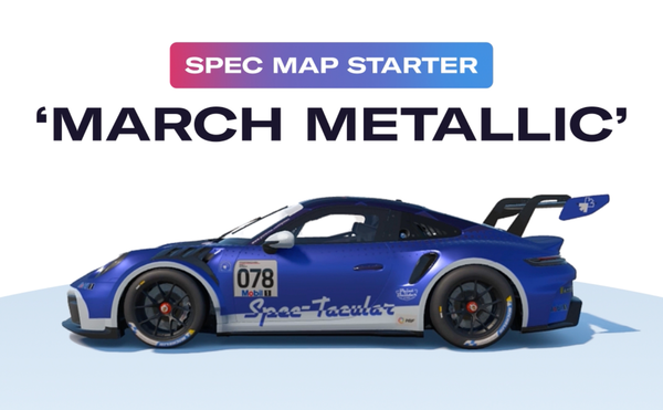
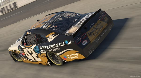
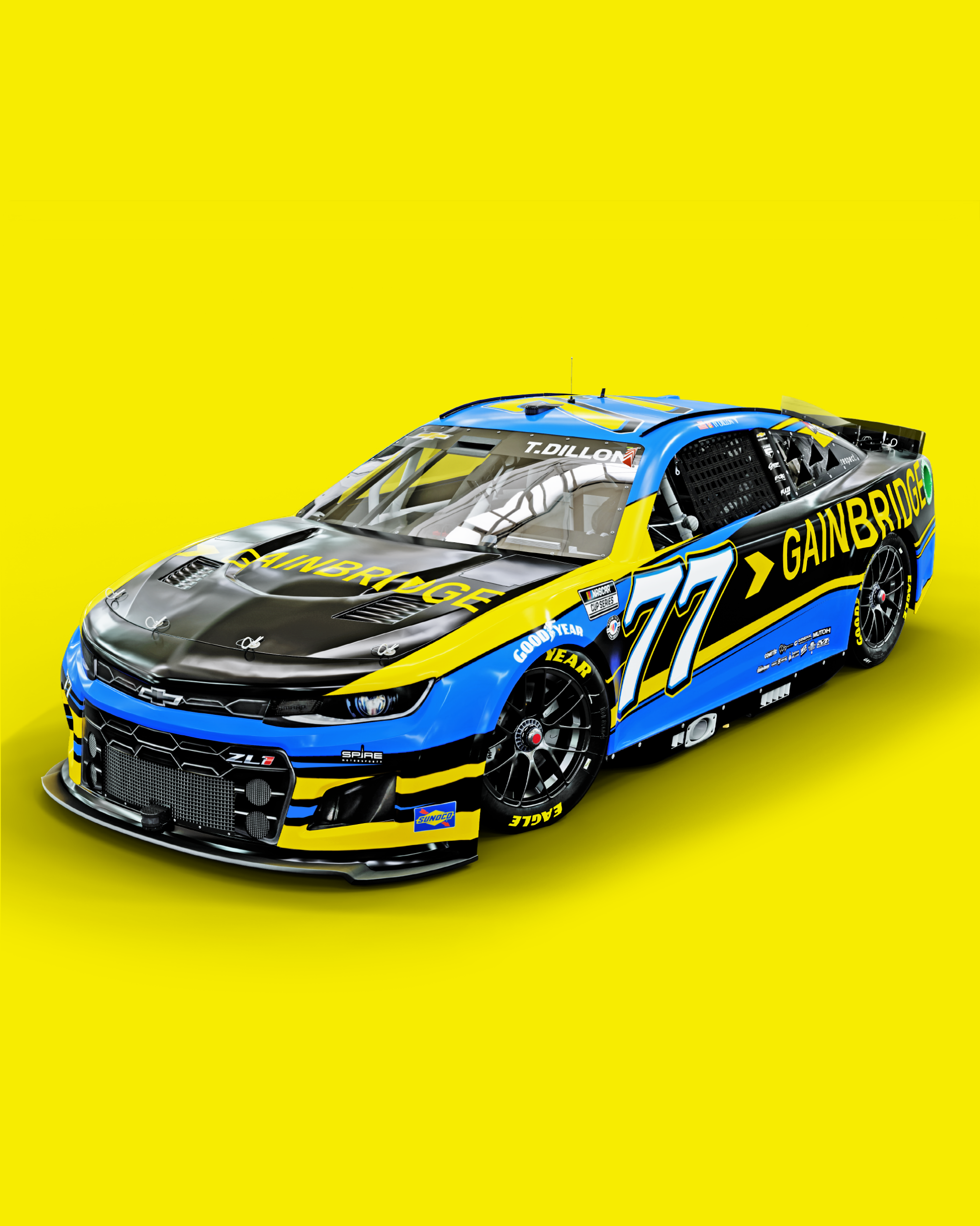
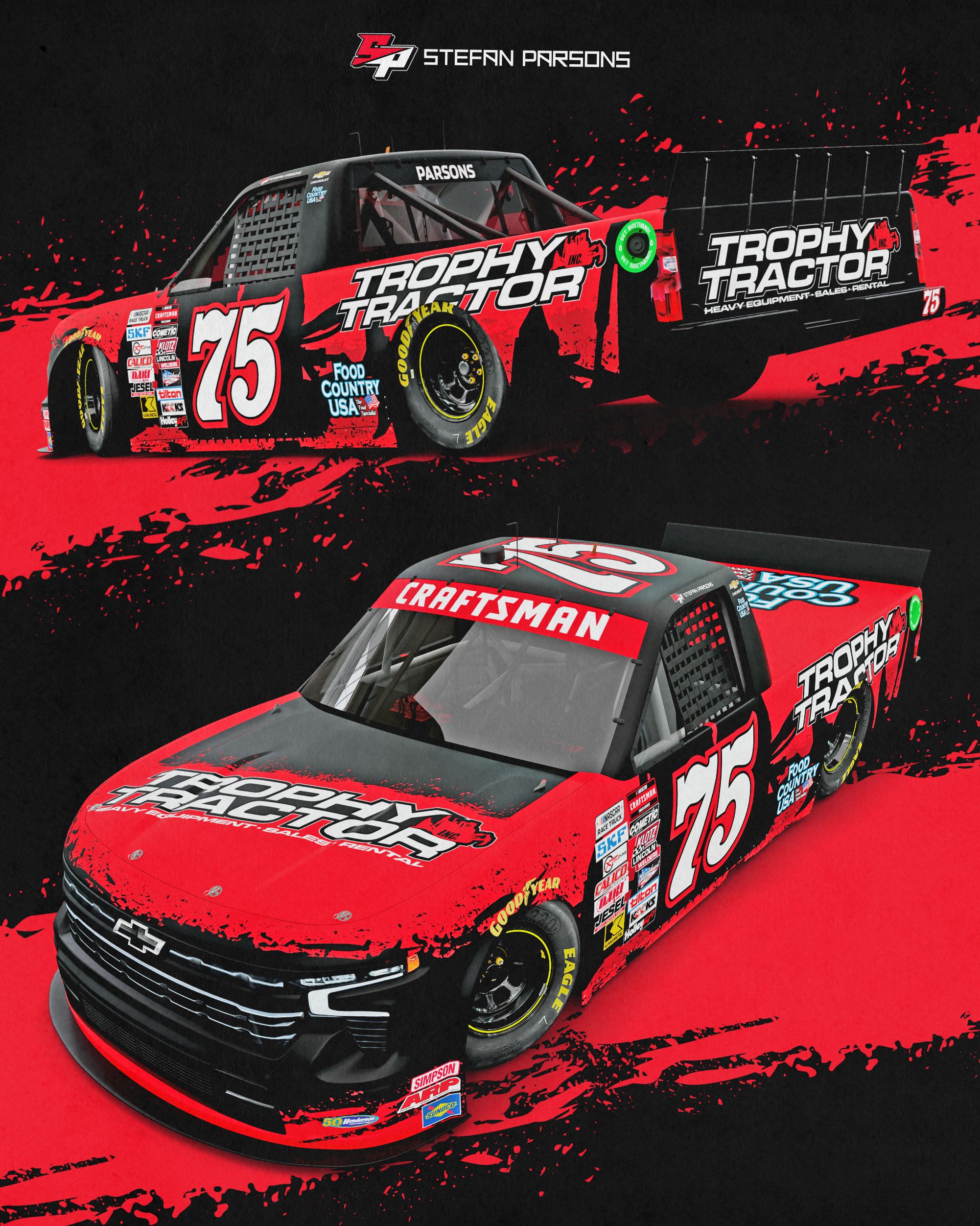
Ryan designs paint schemes and for numerous teams across NASCAR’s top series, including Spire Motorsports, RSS Racing, StarCom Racing, as well as individual drivers. He’s one of the most popular creators on Trading Paints, too, between porting over his real-world designs for iRacing, as well as painstakingly recreating historical cars.
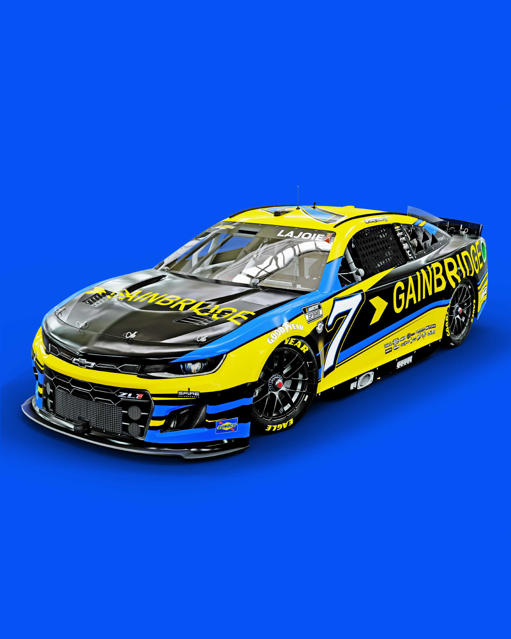
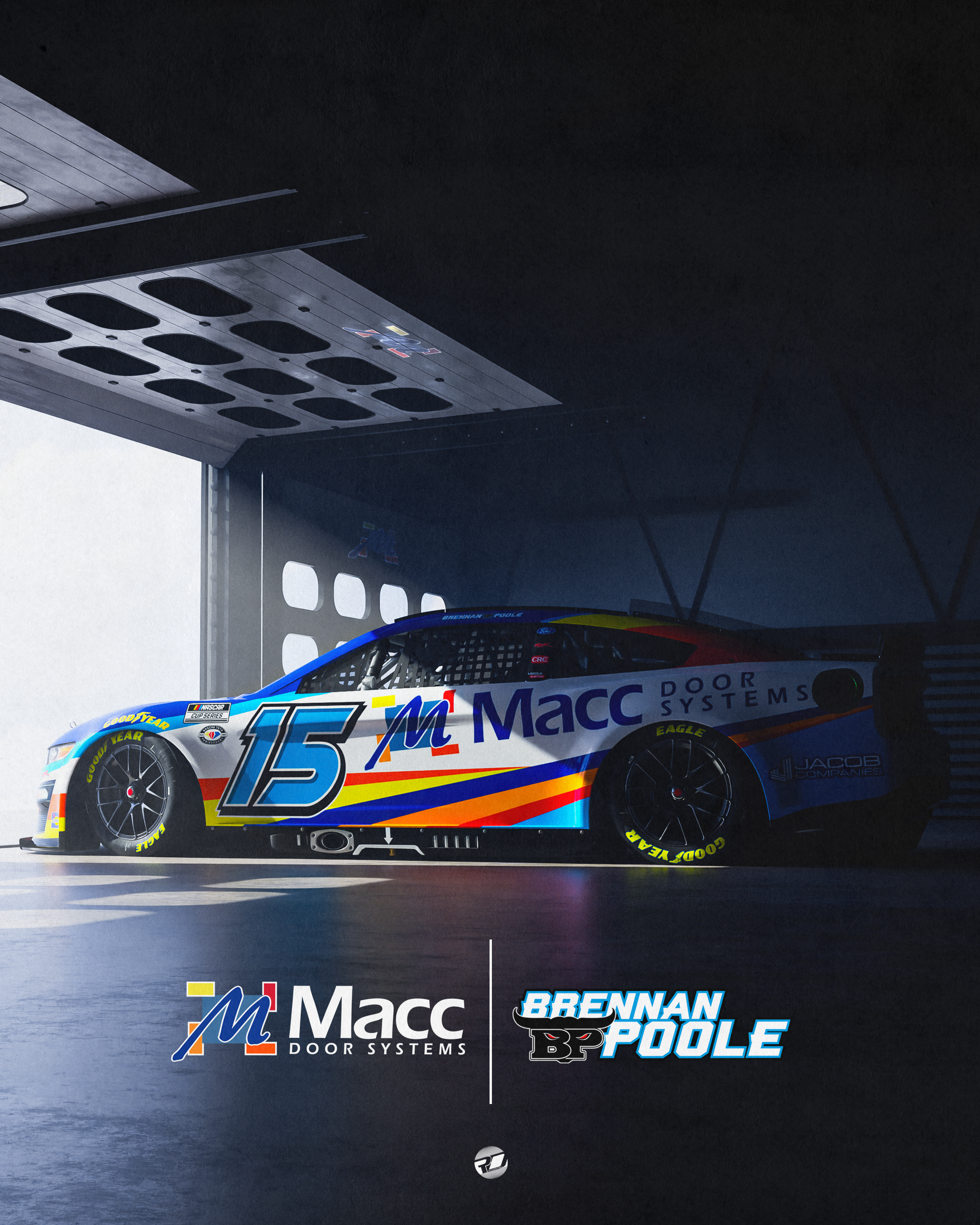
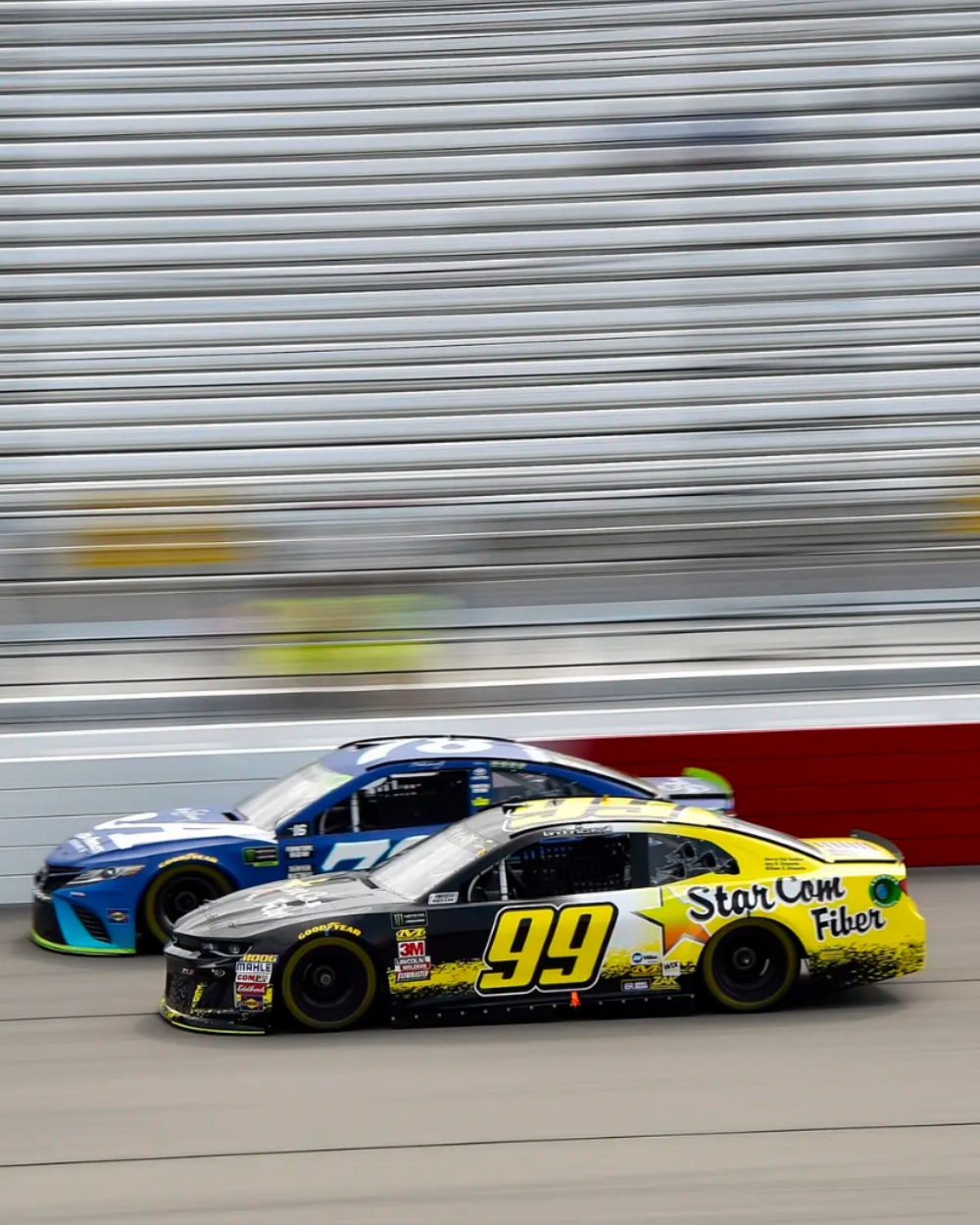
A small sampling of some NASCAR Cup Series designs created by Ryan Daley
1️⃣ How did you get your start designing?
Ryan: When I was a kid I used to love drawing side views of paint schemes I liked, kind of like the spotter guide style. Eventually around 2005 or 2006 I learned I could paint cars using NR2003 and transitioned over to that, recreating real life cars and fantasy schemes. My first couple ones were very bad, and were done using MS Paint!
2️⃣ Where do you turn for inspiration?
Ryan: I always tend to go back and look at vintage paint schemes; I have the whole Formula 1 Car-By-Car book series and that’s always fun to take a look through.
I also really love vintage ads as well. I have a bunch of old music magazines from the ‘70s and ‘80s and there is a ton of creative design throughout those. So many good fonts as well. There are a few contemporary designers like Ryan Williams or Kyle Sykes that are constantly pushing boundaries and people like that will always be a great inspiration for fellow designers.
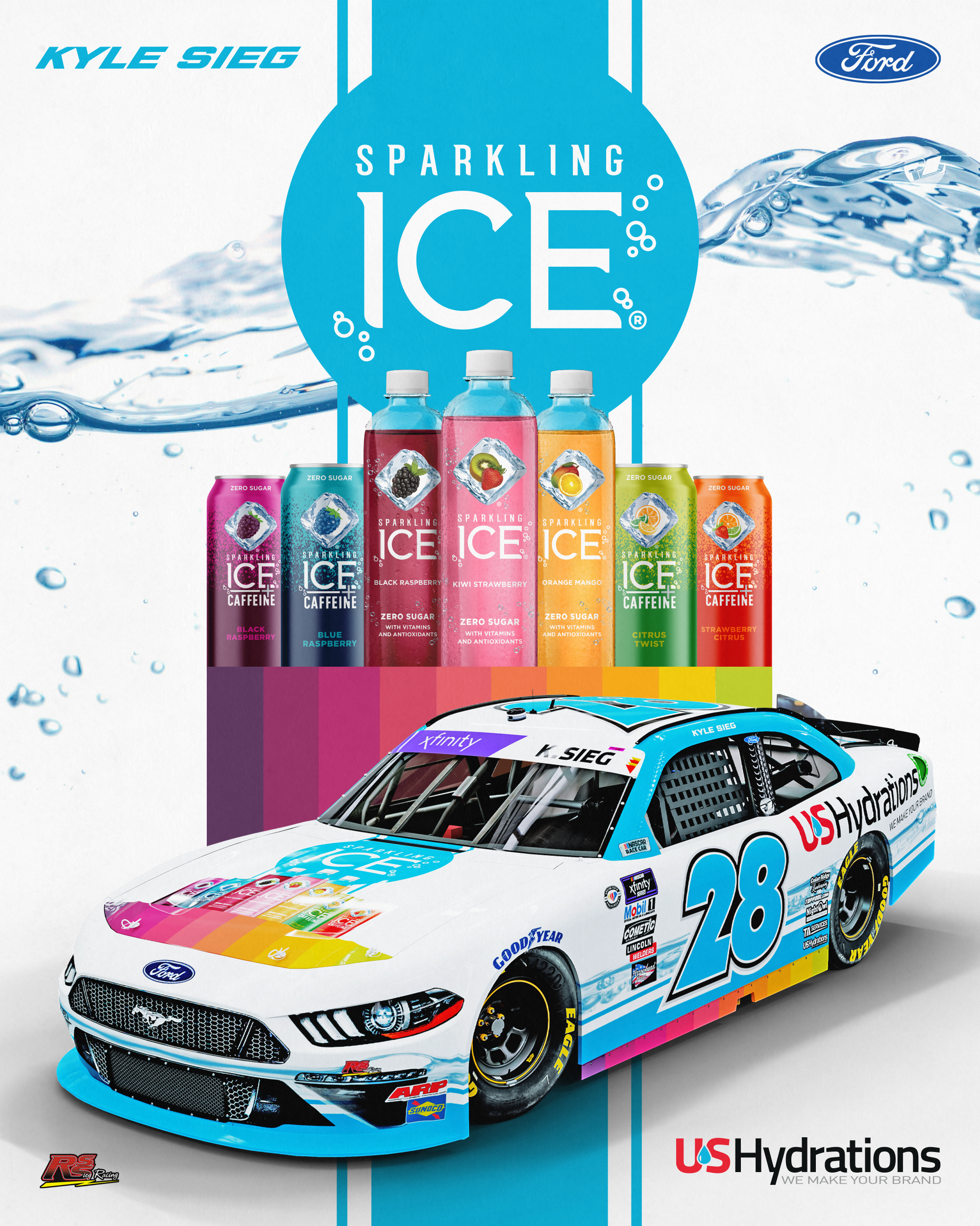
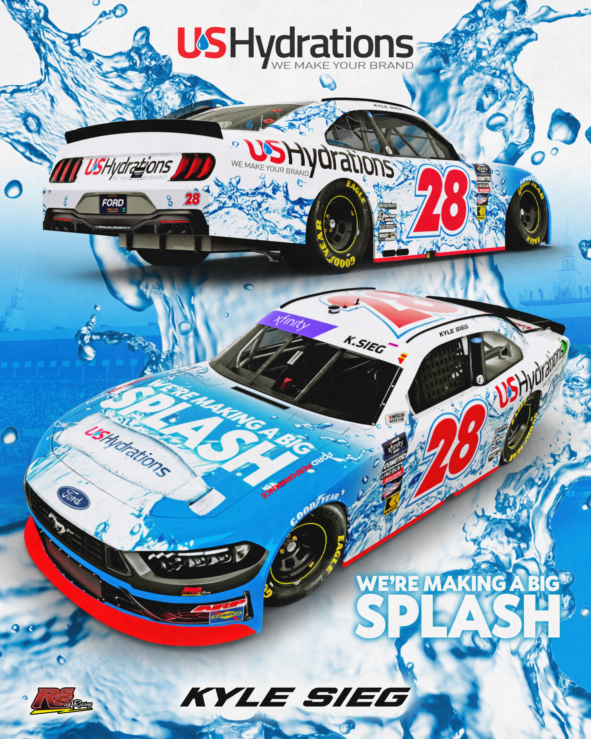
Ryan helps RSS Racing look great on the track!
3️⃣ What project of yours are you most proud of and why?
Ryan: Probably getting to design some of the #7 Spire [Motorsports] cars while they were still at their former shop that was originally built and used by Alan Kulwicki. AK’s story fascinated me as a kid and I am not sure I would have the same interest or involvement in racing had I not read about it when I was young, so it was kind of a full circle moment to be designing #7 cars that were being run out of the shop on Victory Lane right behind Charlotte Motor Speedway.
The first one was the Aerovanti scheme that raced at Charlotte in 2023 and Spire had gotten some photos of it in the shop. I ended up coming across some old shop photos from the AK days and everything was pretty much the same except for some new paint on the walls and Spire logos where the AK logos used to be, so that was crazy to compare them.
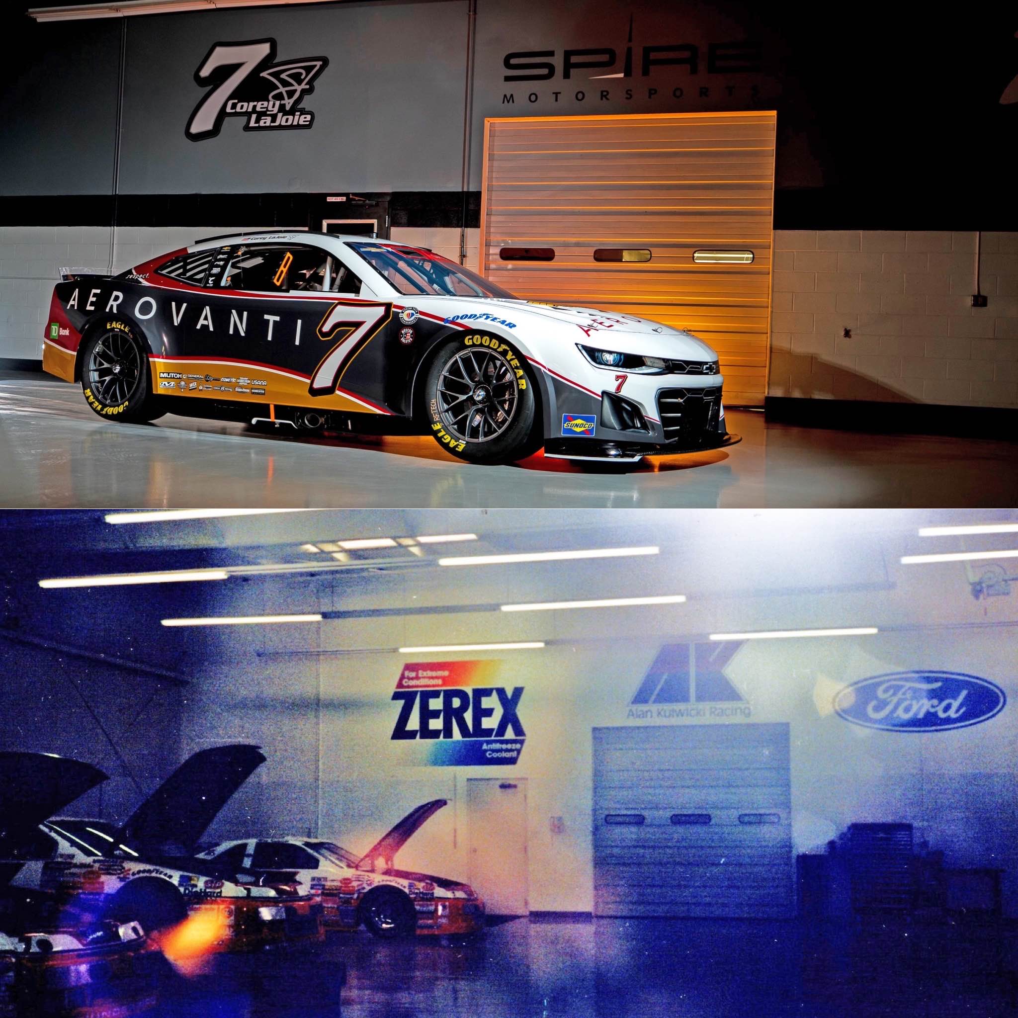
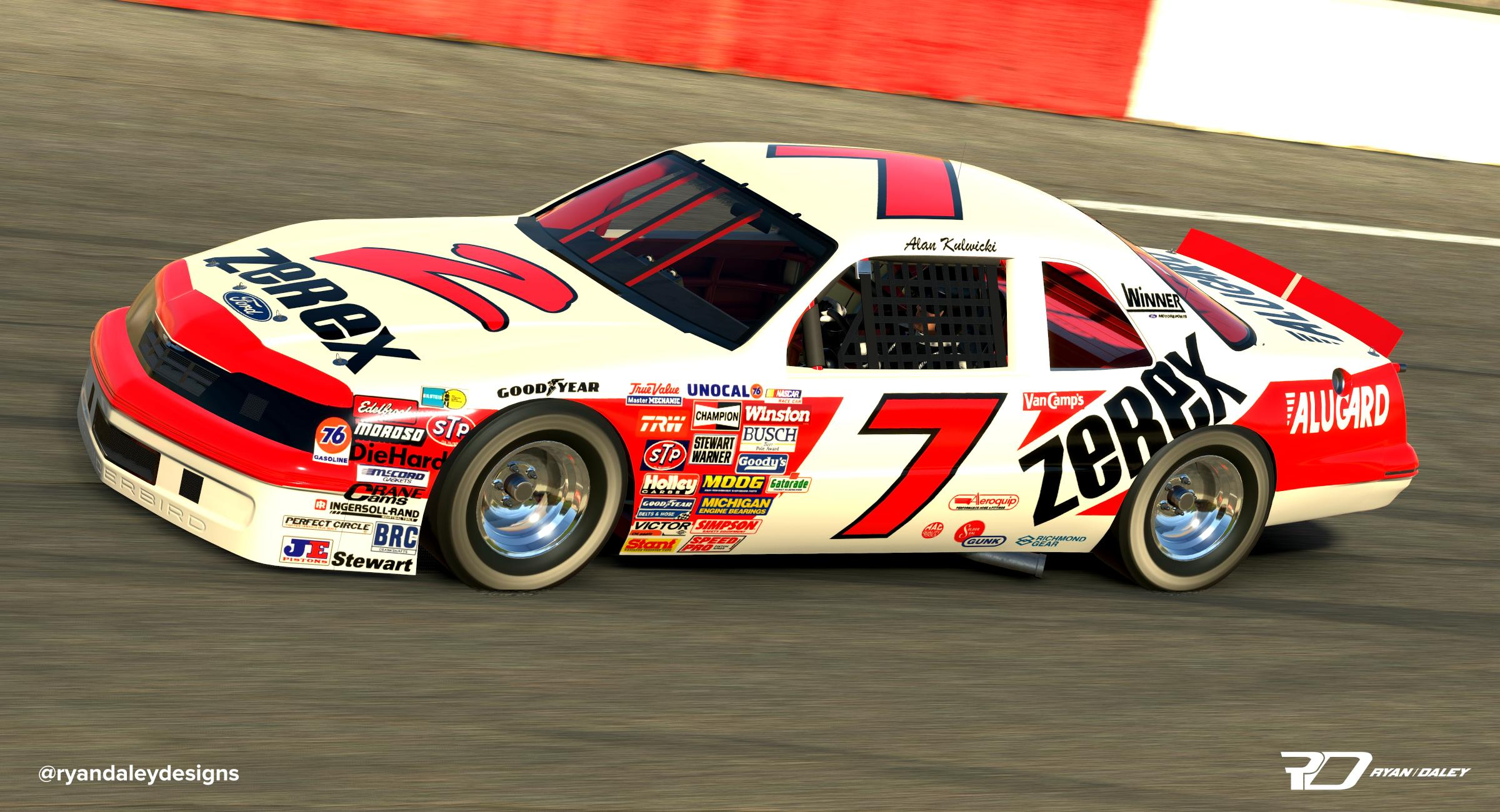
Editor’s note: Ryan’s also an avid painter of 1980s-style NASCAR cars, including Alan Kulwicki’s 1987 Zerex Ford Thunderbird. Ryan also mentioned he’s a fan of William Goshen on Trading Paints and his “killer historical cars” (actual quote—and he’s totally right).
4️⃣ What’s your ‘trademark’ style that helps you stand out from other designers?
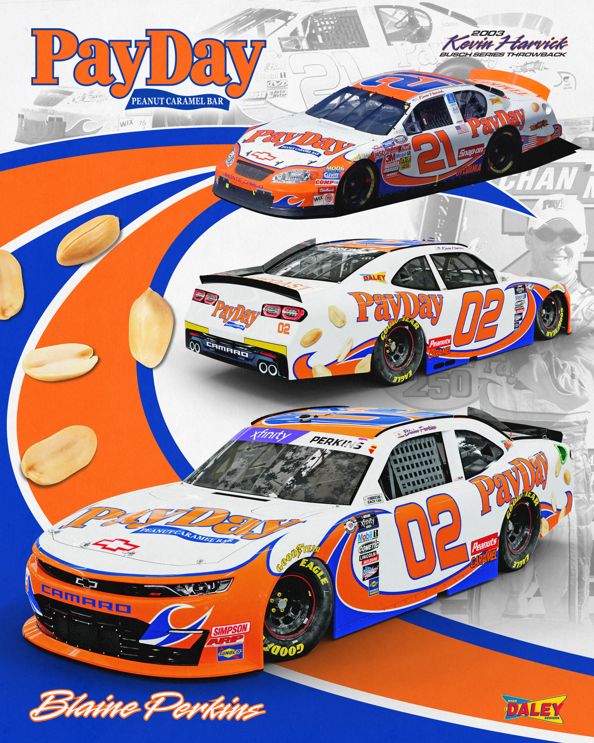
Ryan: I would say mixing the vintage inspirations along with original current ideas, but I really cannot claim that because there are some really great designers that have a similar style past and present. I do tend to use a lot of clean lines and follow body lines on cars when it works. Overall I just try to make sure that there is no problem reading the sponsors or numbers on car schemes and that nothing looks overdone. I used to be bad about not knowing when to stop adding things.
5️⃣ What’s the project that has taken the most amount of time or effort?
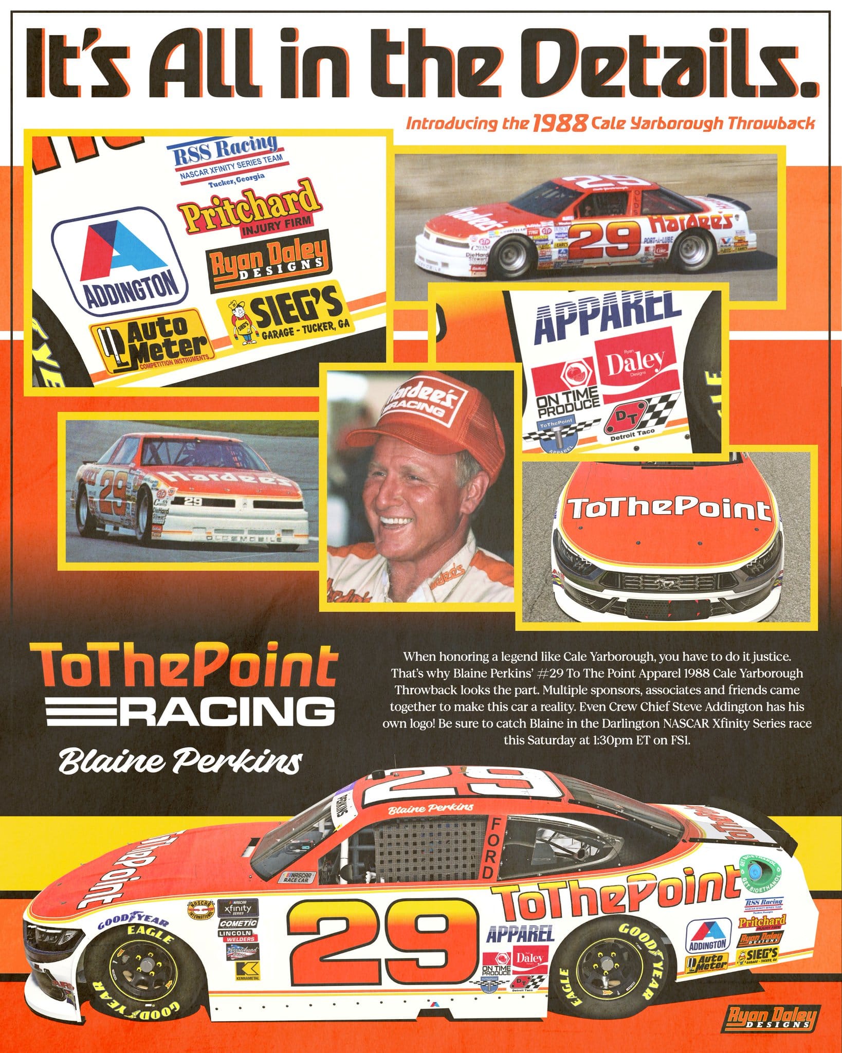
Ryan: Definitely some of the throwback cars from the past few years. The most recent one done for Blaine Perkins, which was a throwback to Cale Yarborough’s 1988 and final Cup car, is a good example. Luckily for this one, enough people came together to be able to recreate every logo that was on the original car, but on the other hand that meant it would be extra time consuming. It is always worth it, though!
6️⃣ What’s your favorite racing-related movie?
Ryan: Le Mans with Steve McQueen from 1971 or Grand Prix from 1966. The cinematic racing scenes in both are epic. The drama away from the racing is a bit cheesy, but honestly, which racing movie does not have that (laughing)? The race start scene from Le Mans with the heartbeat and natural sound is a great one to check out.
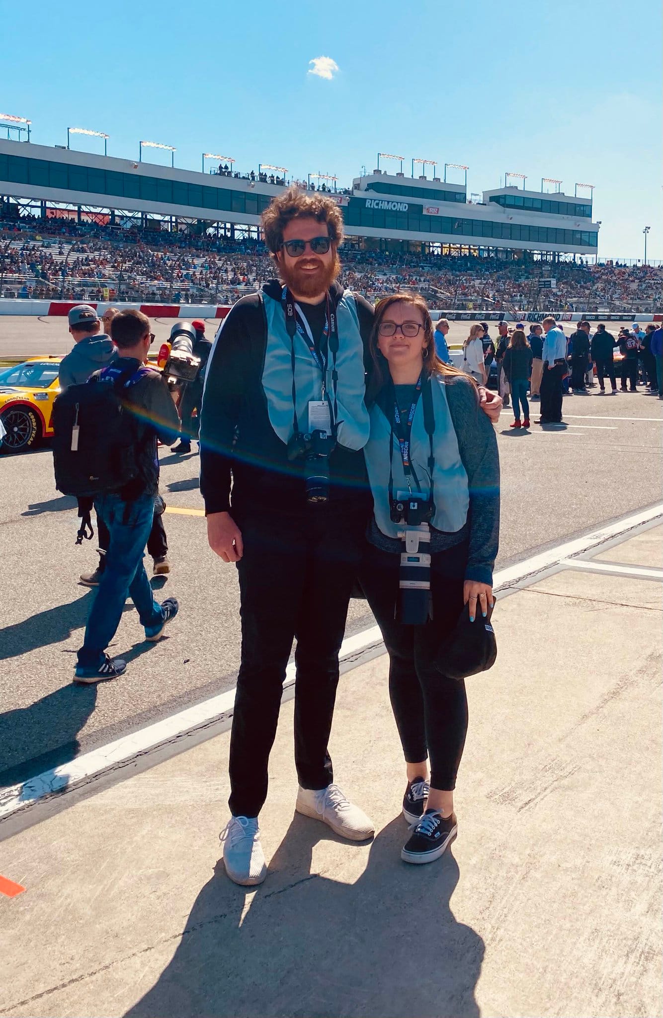
7️⃣ What’s the biggest difference between designing for fun and designing for paid work?
Ryan: The biggest difference when designing for paid work is that you have to work with other people and take into account all of their suggestions, what they want to see, and a lot of times, brand guidelines as well. When designing for fun, you are able to create a perfect scenario and do exactly what you want, but nine times out of 10 that is not how it goes with real life projects.
It is important to be able to work with other people and be able to take their suggestions and turn it into something feasible. You’ll run into people that you may not agree with design-wise — and it is OK to make suggestions — but it is important not to forget that you are doing a project for them and not you.
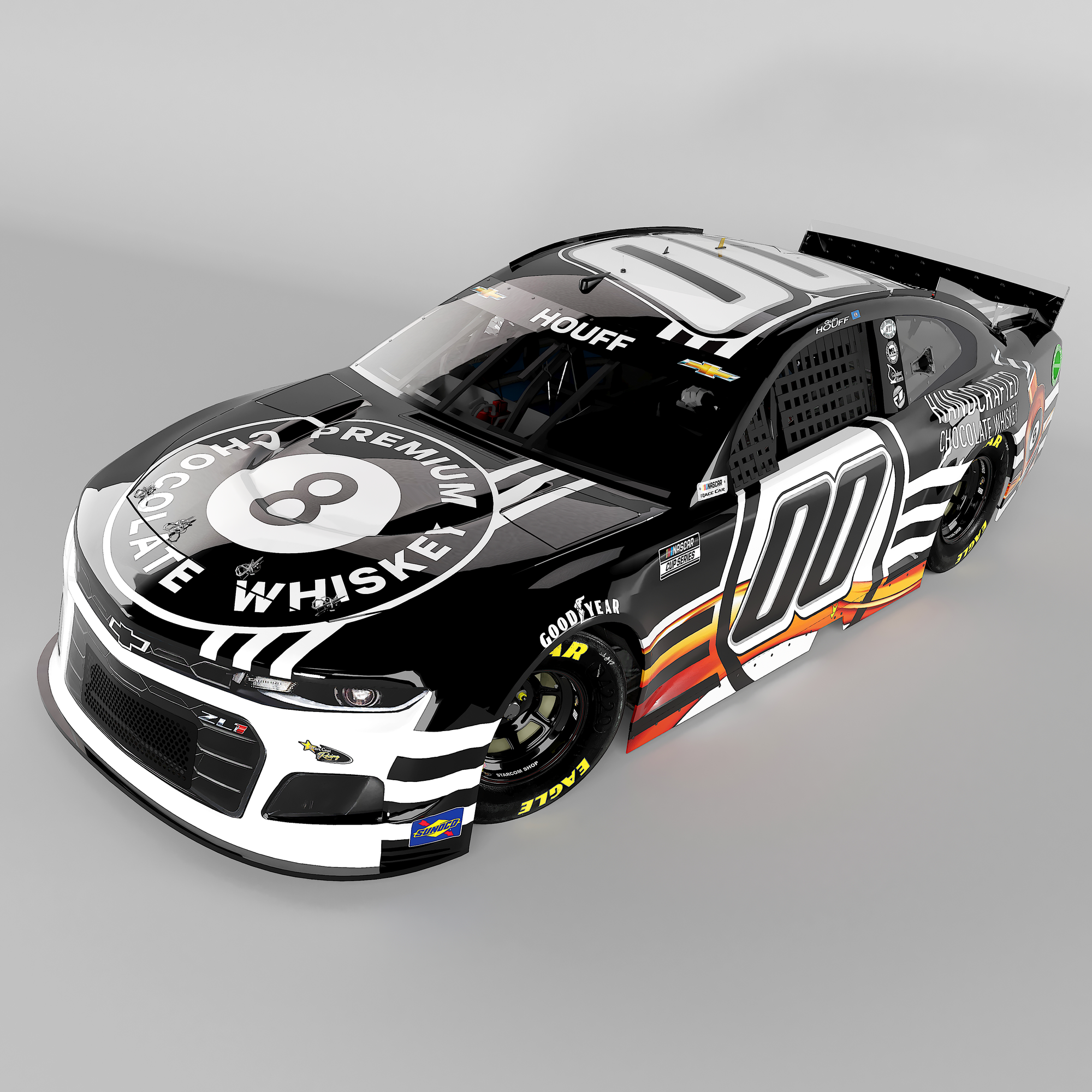
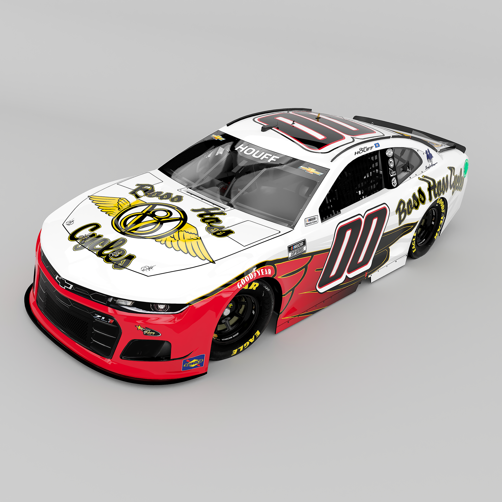
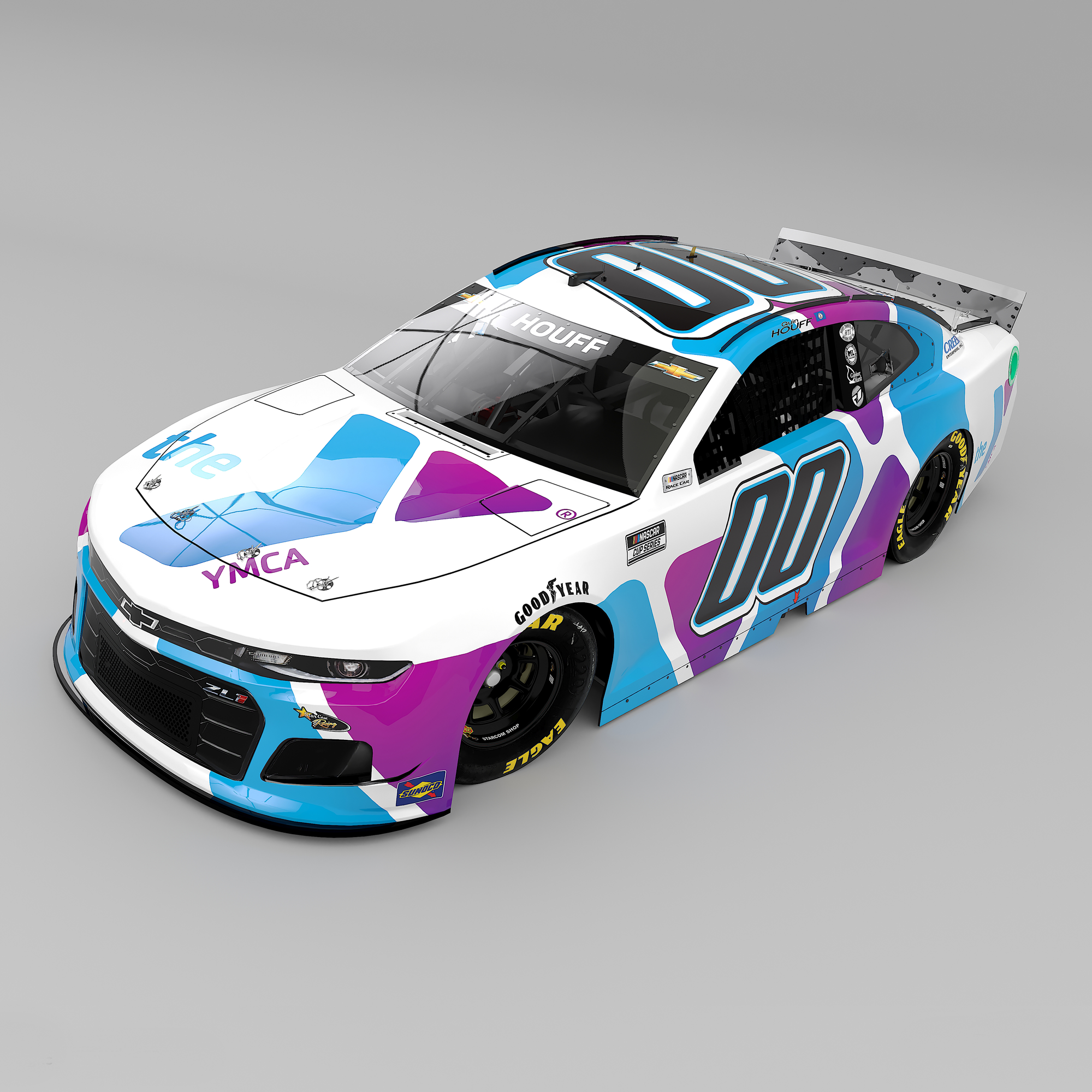
A sampling of some of Ryan’s StarCom Racing paints.
8️⃣ Share a design tip for people just getting started.
Ryan: Familiarize yourself with Adobe Illustrator and working with vector art as early as you can. All of the car wraps, driver suits, apparel, etc. are designed using vector art. There are plenty of items that are designed using Photoshop and that is still an important program to master, but if you are wanting to design car schemes learning Illustrator is a must.
Some additional work from Ryan Daley
Thanks to Ryan for taking the time to talk paints!
For more, check out Ryan’s Trading Paints page. 🏁


