Artist Spotlight: Camille Yetter
She walked into a well-respected design university for Equestrian Studies. One suggestion from a professor and a message later, she’s found a new career path.

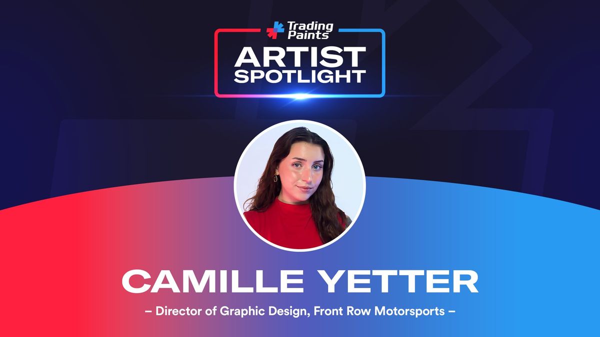
She traded horses for horsepower. The result? A career deviation with legendary names in motorsports that many fresh graduates could only dream of. This is Camille Yetter, Director of Graphic Design for Front Row Motorsports.
1️⃣ How did you get your start designing?
I had always been into art from a young age, but I started to hone in on design once I started school at SCAD [Savannah College of Art and Design].
2️⃣ Where do you turn for inspiration?
There isn’t really one direct source for me. Obviously Instagram, Behance, and Pinterest are great starting points for inspiration, but I also love to look at old print design, sneaker advertisements, and physical media. You can find a ton of inspiration in your day-to-day. I spend a lot of time watching sketchbook tours and videos within the same vein.
3️⃣ What project of yours personally are you most proud of and why?
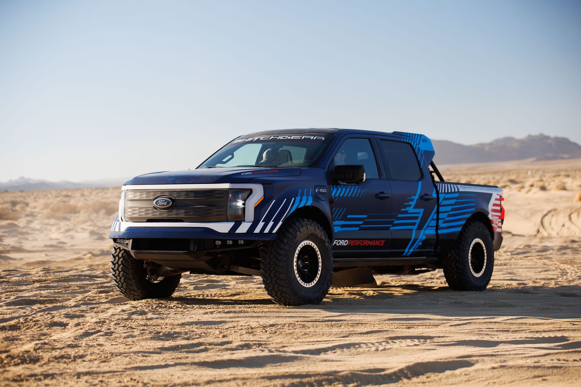
The project I am most proud of has to be the Ford Lightning Switchgear livery. Ford Performance came to us (RTR Vehicles) and asked for our help in designing a livery. I initially used the negative space of the Speedblock to make the shape of a lightning bolt on the rear quarter.
We eventually ended up just outlining it to match the other FP liveries at the time. Ford Performance then went on to use the lightning bolt on all EVs moving forward and kind of acted as its own visual language. I had support on the livery from my colleagues Lindsay Ross and Hayden Sheppard.
4️⃣ What’s your ‘trademark’ style that helps you stand out from other designers?
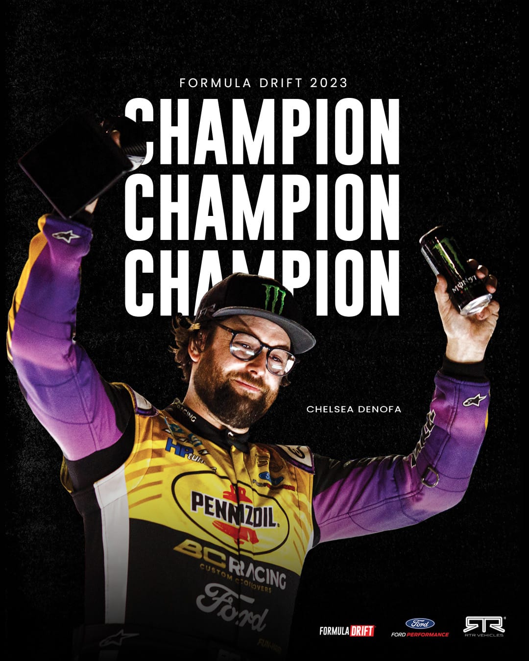
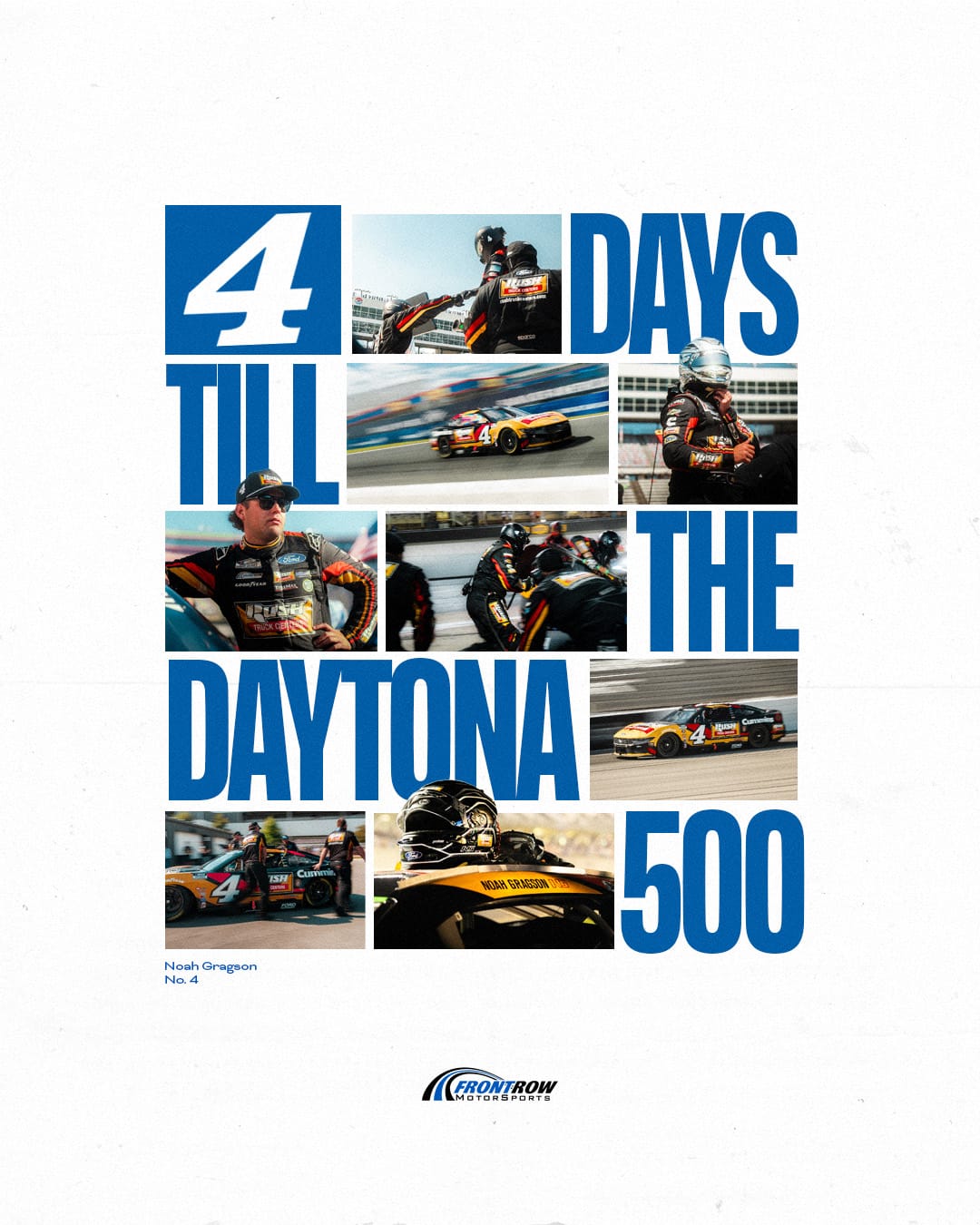
I would say my ‘trademark’ style is very dependent on clean typography and visual balance/interest. Not all designs need to be reliant on imagery or illustrations. Bold type can be just as impactful. I also like to dabble with digital collage so I’ll use elements like tape, torn paper, and marker elements.
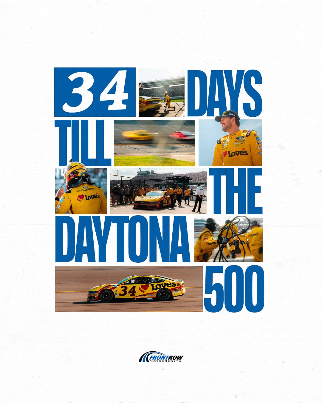
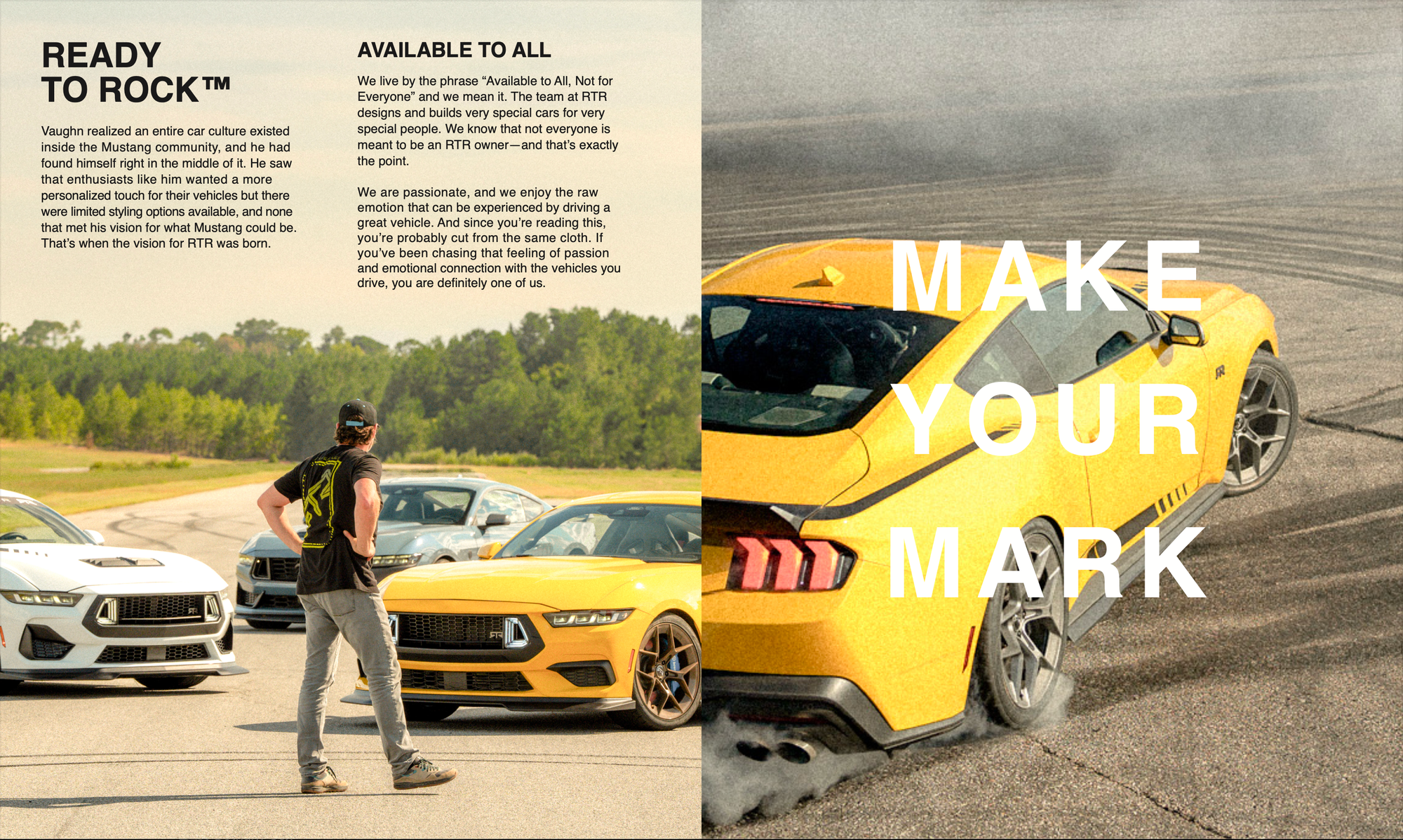
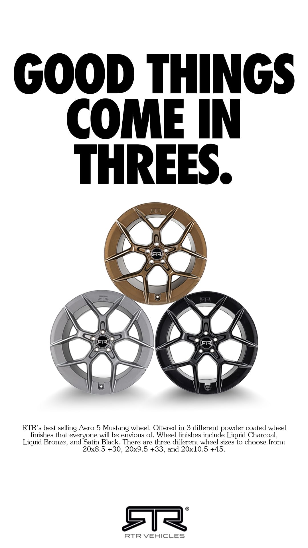
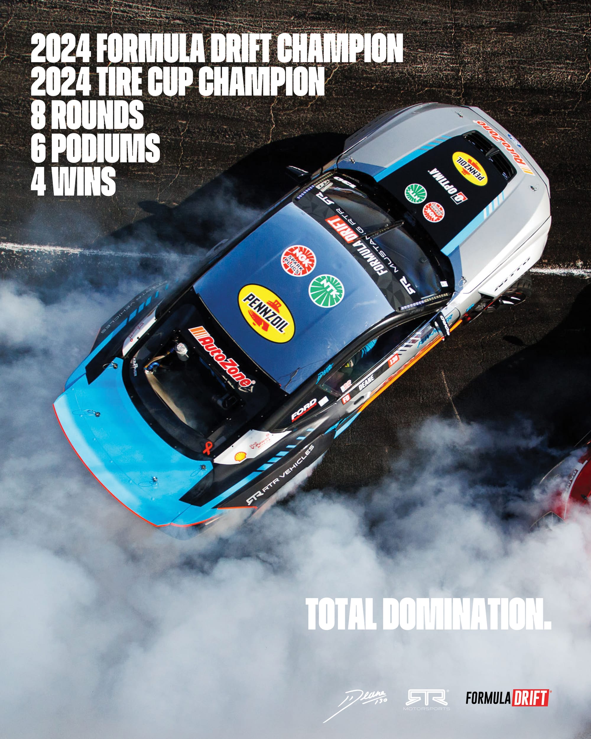
Typography has become a key aspect of her Camille’s designs. (Graphic Credit: Camille Yetter)
5️⃣ Since 2021, you’ve been in the world of motorsports between Hoonigan, Vaughn Gittin Jr., and now Front Row. How did you end up navigating your career into motorsports and was that part of the plan all along?
My career in motorsports is kind of a funny story. I actually applied at SCAD with the intention of getting a degree in Equestrian Studies but switched over to Graphic Design. I had a design professor suggest that we send physical samples of our work to companies or people we wanted to work for. I sent a DM to Brian Scotto on Instagram looking for a mailing address and got a message back saying he digged my vibe and wanted to know my interest levels in moving to LA. I was working on Lucy Block’s ARA livery two weeks after I graduated with no prior experience designing race cars.
I would then go on to work with Hoonigan Industries later that year on a SEMA project for Mobil 1. I’m forever grateful for Scotto, Ron, and Ken and Lucy for giving me the opportunity.
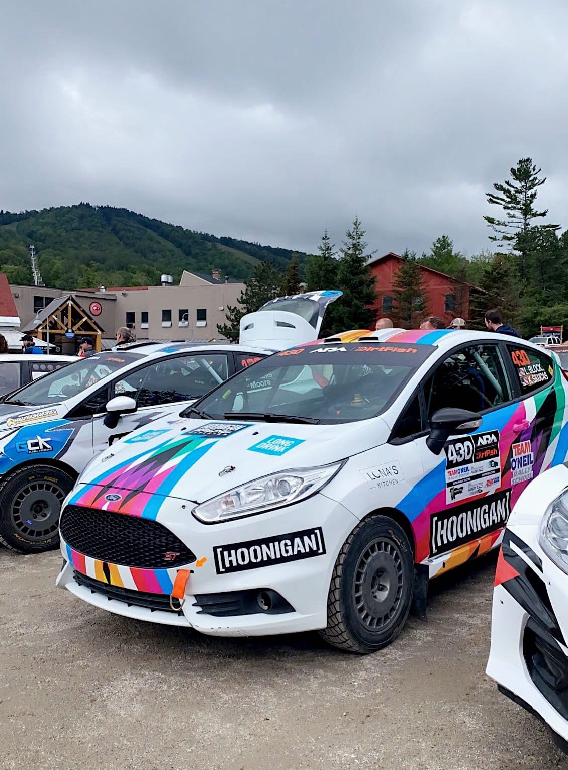
(Photo Credit: Camille Yetter)
6️⃣ When you arrived at Front Row, what was something that the team didn’t have that you instantly knew that you wanted to add to the design vocabulary of the team?
There wasn’t really anything in particular that felt like it needed to be added to FRM’s design vocabulary. I came in and used what was already existing as a base and evolved it to match my style. Maybe the addition of edge and attitude if you want to consider that as design vocabulary. There needed to be a bigger voice to the designs.
7️⃣ As you’re approaching your one-year mark in NASCAR full-time, what’s one thing about the design world of NASCAR that surprised you compared to Vaughn?
The one thing about the design world of NASCAR that surprised me compared to VGM/RTR is how expendable designs are. I don’t mean that in a negative way either. It's just a result of the fast paced nature of the series. At RTR, we spent the off season making a million different concept liveries for each vehicle and then had to commit to just one. You had to be super intentional about your designs because that was your image for the entire season.
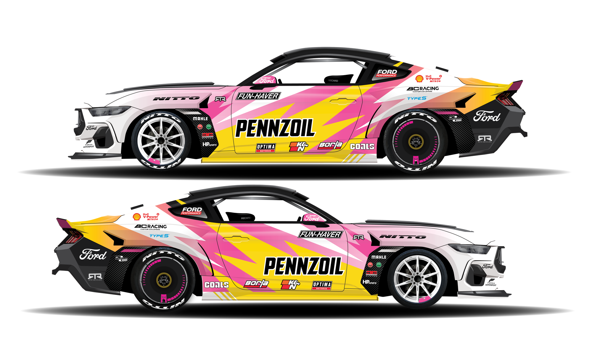
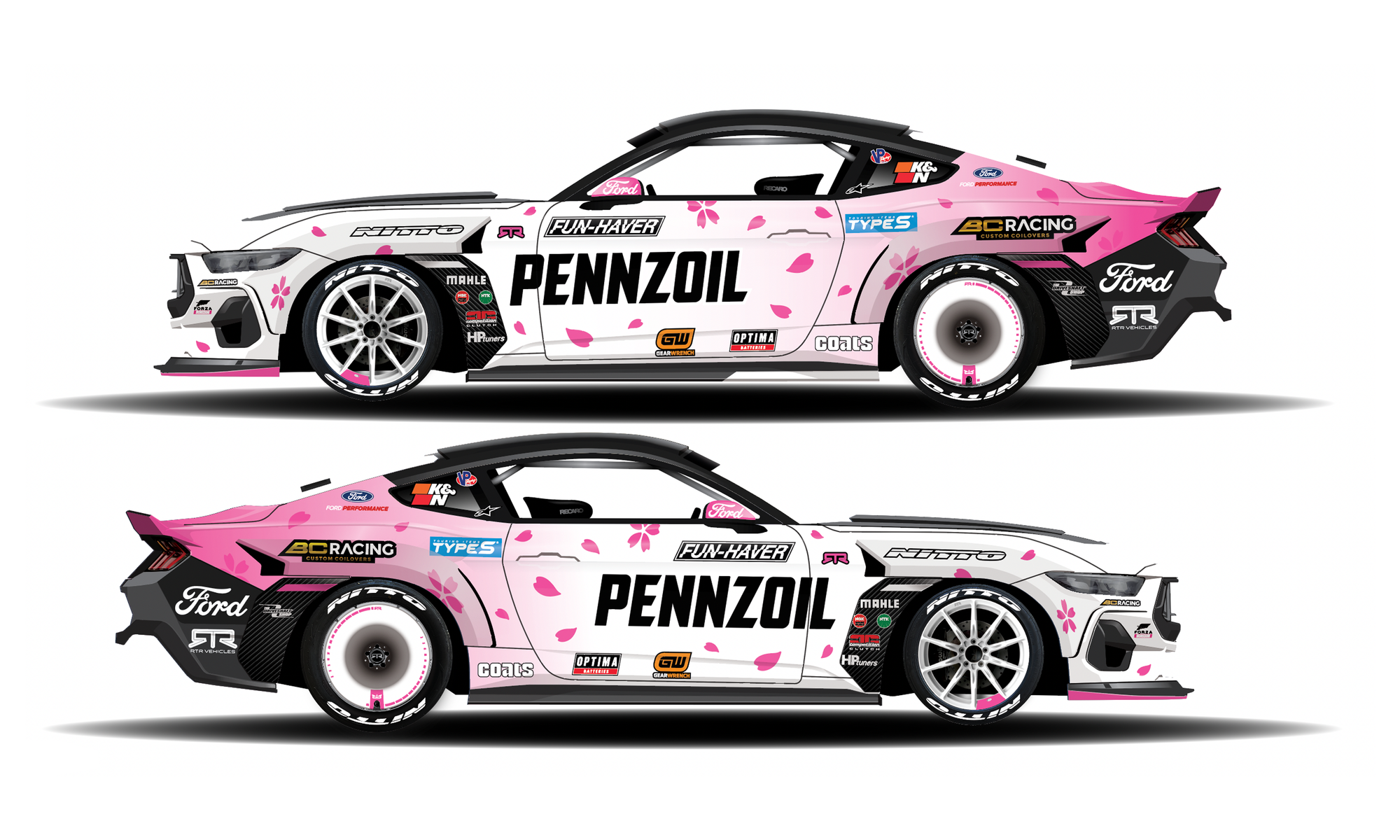
One design for the whole year versus many in a season. (Graphic Credit: Camille Yetter)
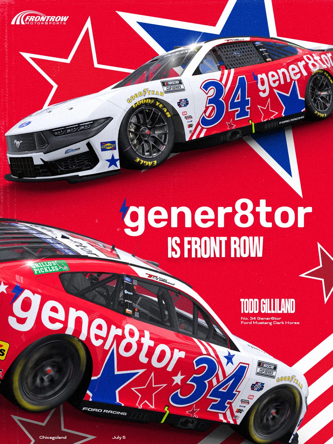
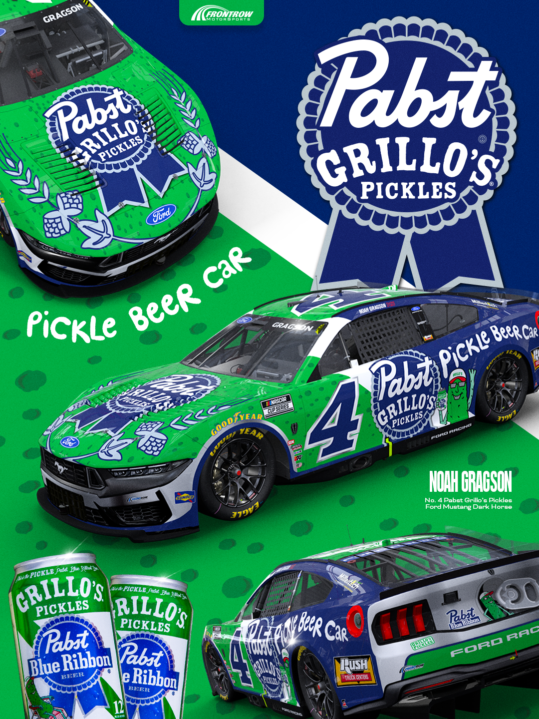
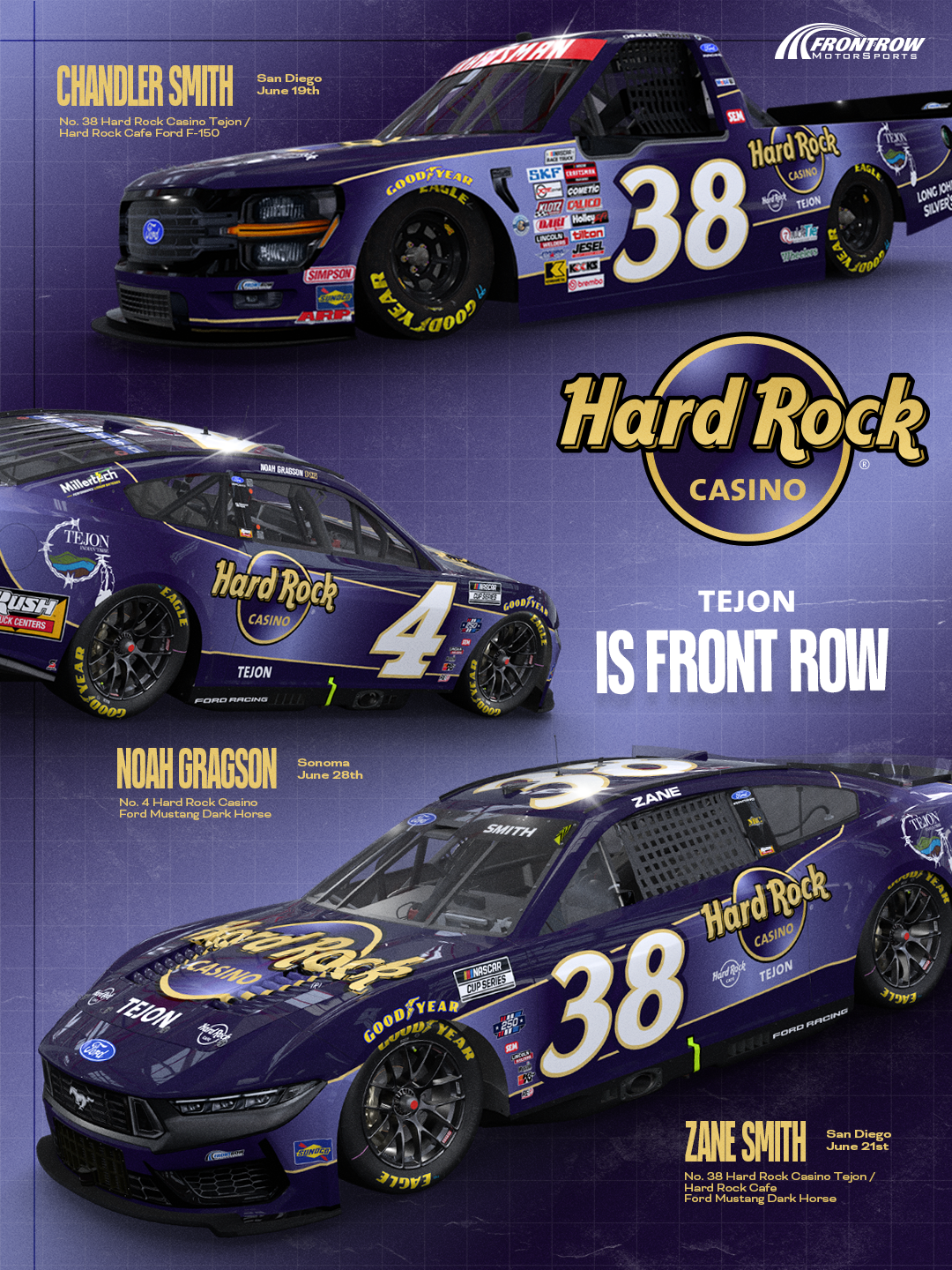
8️⃣ Front Row’s design language for 2026 leans heavy on blue, “[Sponsor] is Front Row”, among other traits. When crafting the brand look and feel for social, what is that process and where did you find inspiration?
So the idea of using “[Sponsor] is Front Row” was in place before I started so I won’t take credit for it. I do, however, think it’s very impactful and quite literal.
As for the brand look and feel for social, I used what was already existing and built new content around that. I love looking at other social channels outside of motorsports for inspiration. I have a folder on Instagram where I save designs as I see them which helps a ton on those days where I don’t really know where to start.
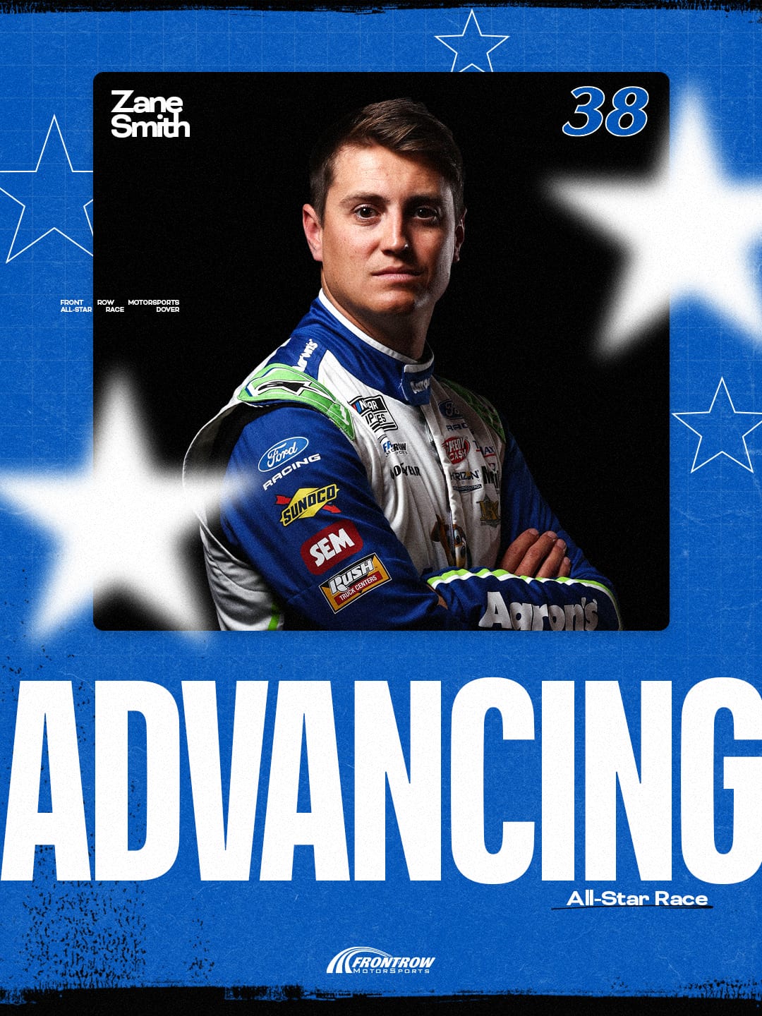
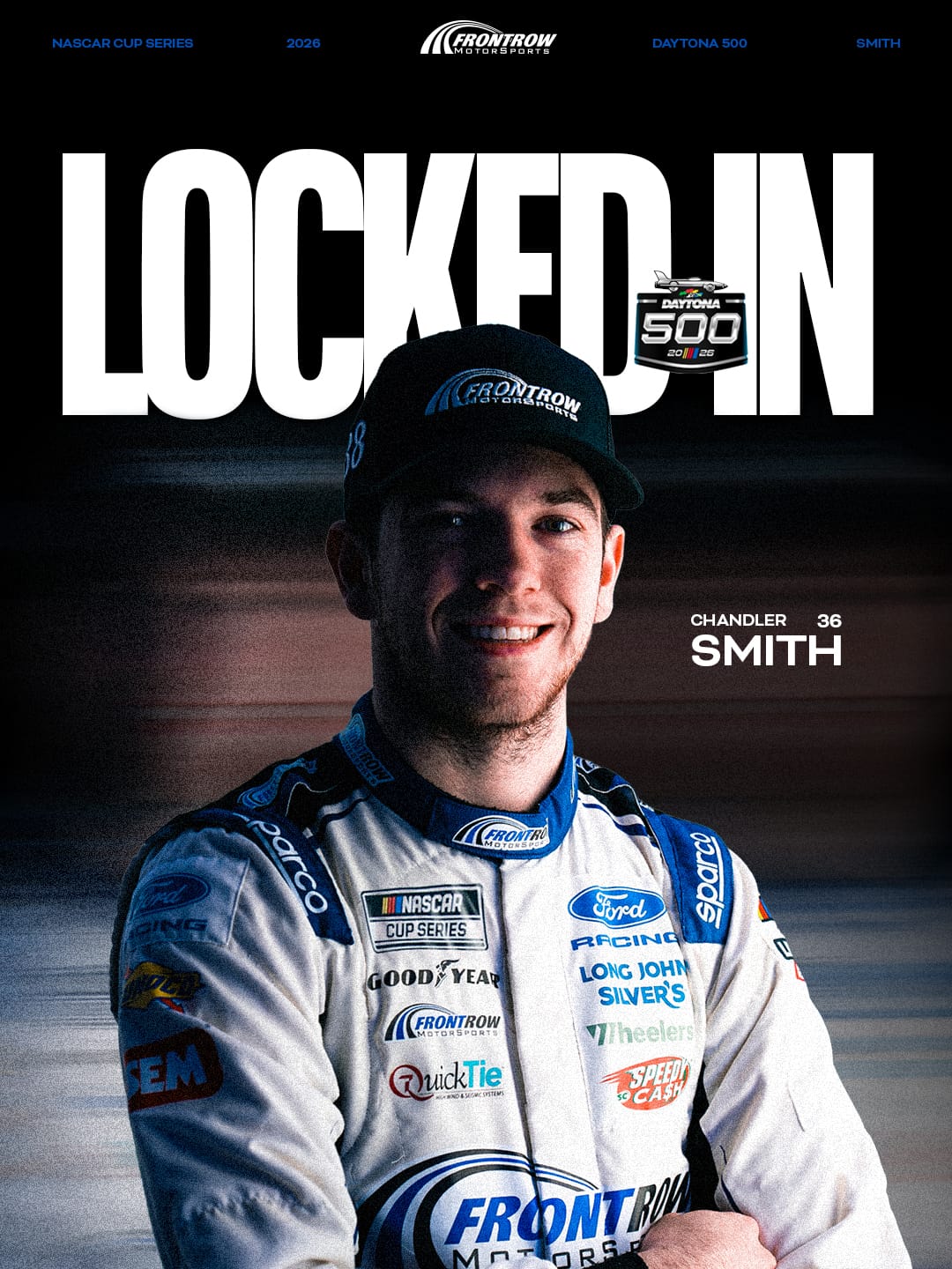
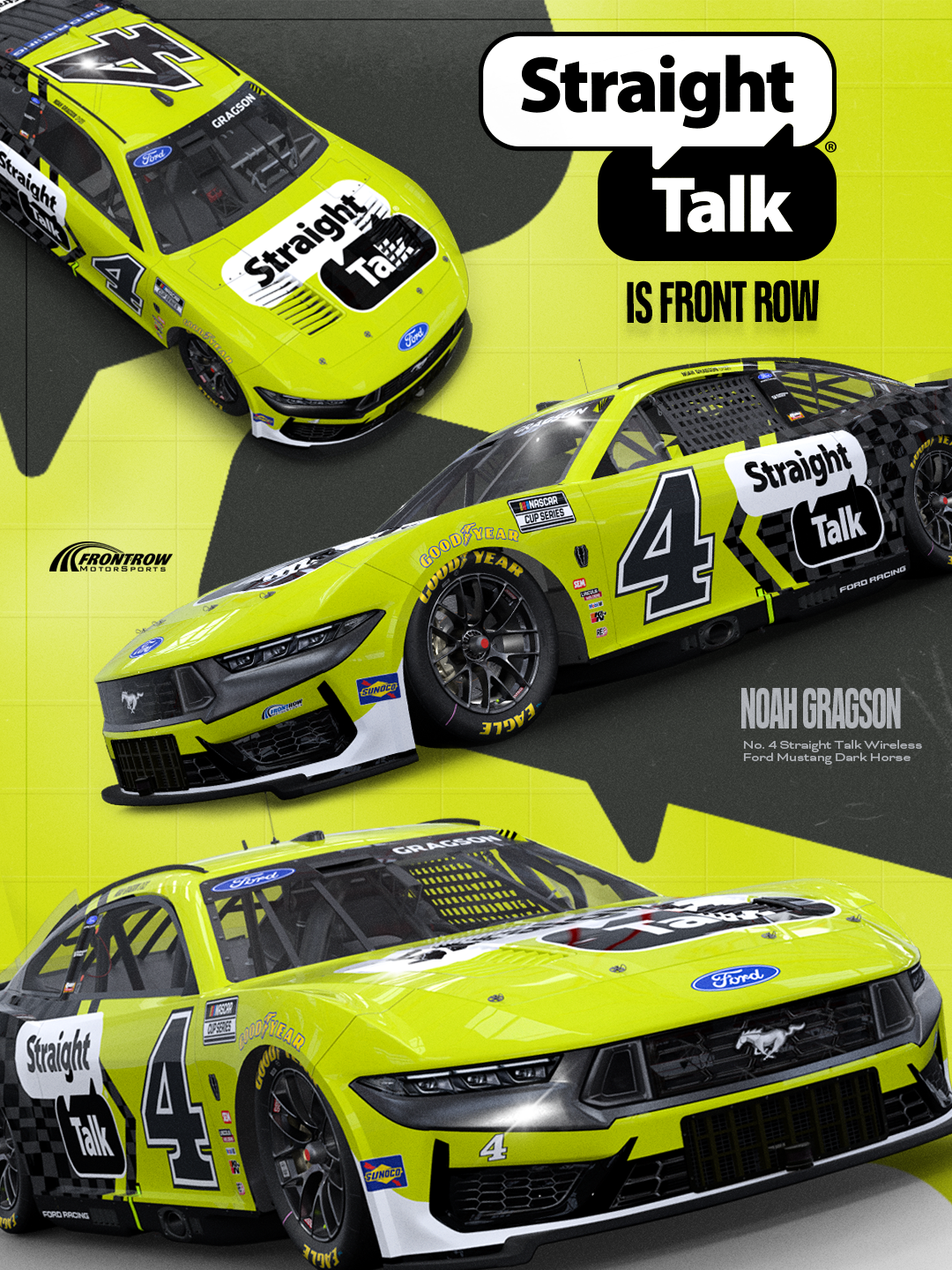
(Graphic Credit: Camille Yetter)
9️⃣ The NASCAR design space is very male-dominated part of the sport. Being one of the few female graphic designers, what do you think the space can improve on to help bridge the gap?
Genuinely, I think it’s just a matter of recognition and giving credit where credit is due. A good designer is a good designer no matter who they are.
🔟 Share a design tip for people just getting started.
Don’t be afraid of putting yourself out there and sharing your work. People/companies are always looking.
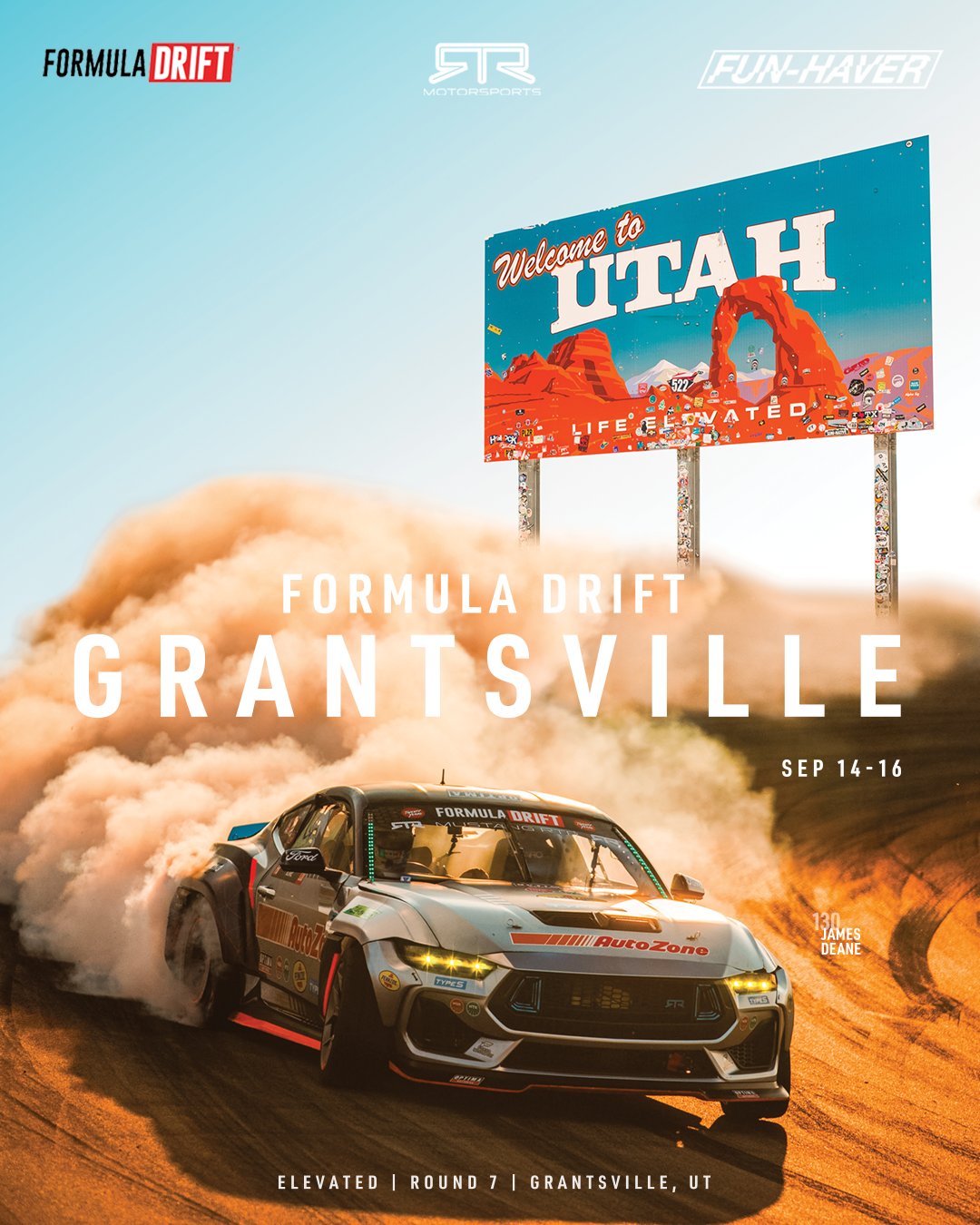
(Graphic Credit: Camille Yetter)
For more, follow Camille on Instagram.